


Taking a closer look at a single game
Combining different graphs and scores to get an overview of a single game

I've written a couple of posts in the past where I looked at different aspects of chess games with engines. I did this all in isolation since I was interested in different ways to look at a game and not too worried about the connection or the overall picture of the game.
But now that I've experimented with many different scores and graphs extracted from games, I thought that it might be interesting to use all of them to look at a single game. I'd also like to analyse more games and tournaments like this in the future, so any feedback about the different scores is highly appreciated.
I'll only give a brief description of each score here and will link to the original posts if you're interested in reading all the details.
I decided to look at game 6 of the Carlsen-Nepomniachtchi world championship match. I picked this game because there were many ups and downs and it was tense for a long time. If you want me to take a look at other games, let me know.
Quality of Play
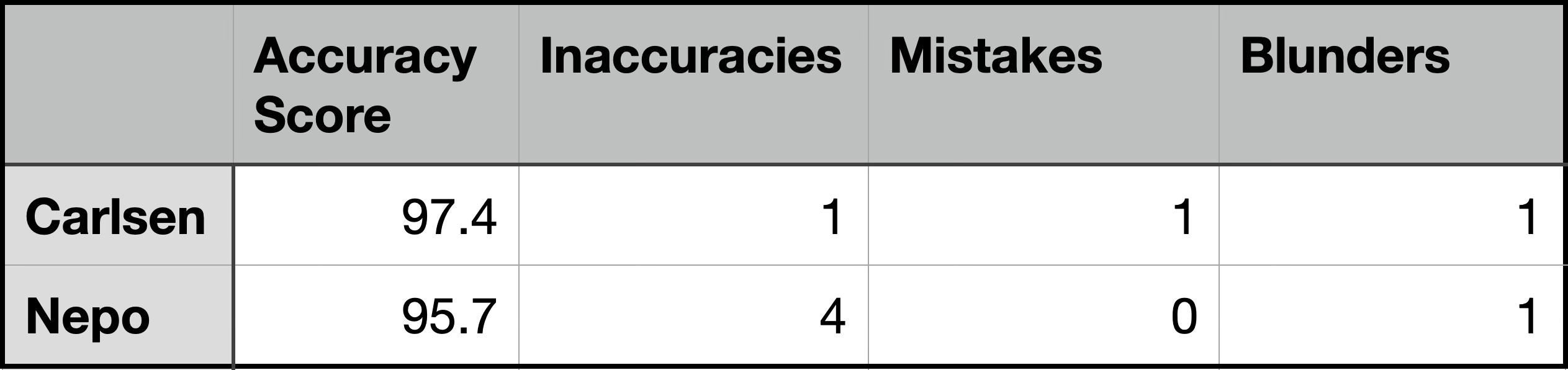
The most basic indicators of quality of play are the accuracies of the players and the number of inaccuracies, mistakes and blunders. I don't find these single numbers too insightful, but I decided to include them for completion.
I prefer to see how the game went instead of some numbers, so I really like the WDL graph of a game. This shows the win, draw and loss probabilities for both sides, calculated by the LC0 engine. Compared to the usual centipawn graph, this gives more insight since an equal position could offer winning chances for both sides or be a dead draw. The evaluation in centipawns "hides" these dynamics, but they can be seen in the WDL.
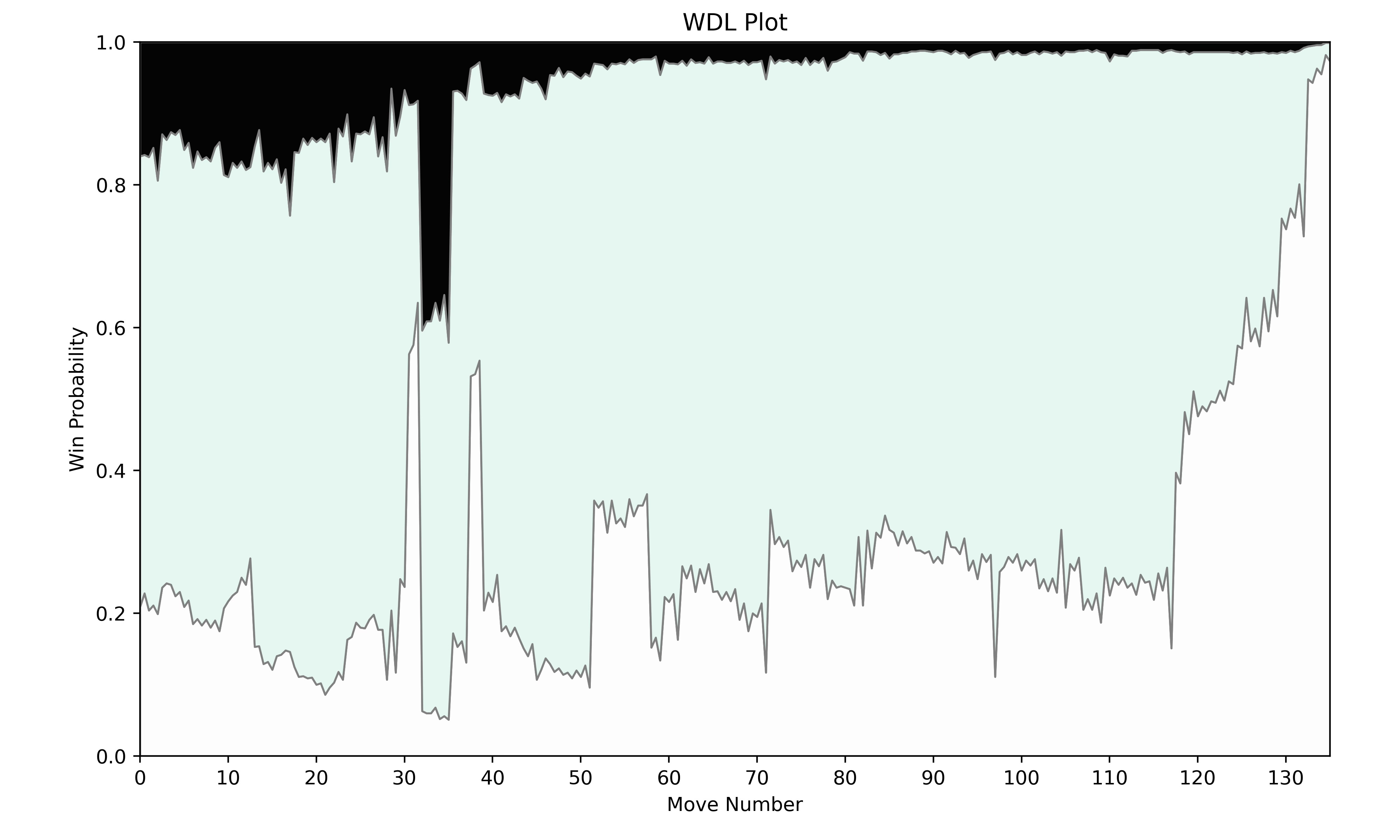
This graph shows that a lot happened between moves 30 and 40. What’s also interesting to see is that afterwards the draw probability was very high, but White could play for a win while Black’s winning chances were minimal.
Sharpness
The WDL in a position can also be used to calculate a sharpness score for a position. The idea behind this score is that a position where both sides have winning chances is considered to be sharper than a position where the drawing chances are high.
To see how sharpness relates to a game, I find it insightful to look at the change in sharpness after each move. If one side plays a move that increases the sharpness, this change will be positive, while a move that decreases the sharpness will lead to a negative value.
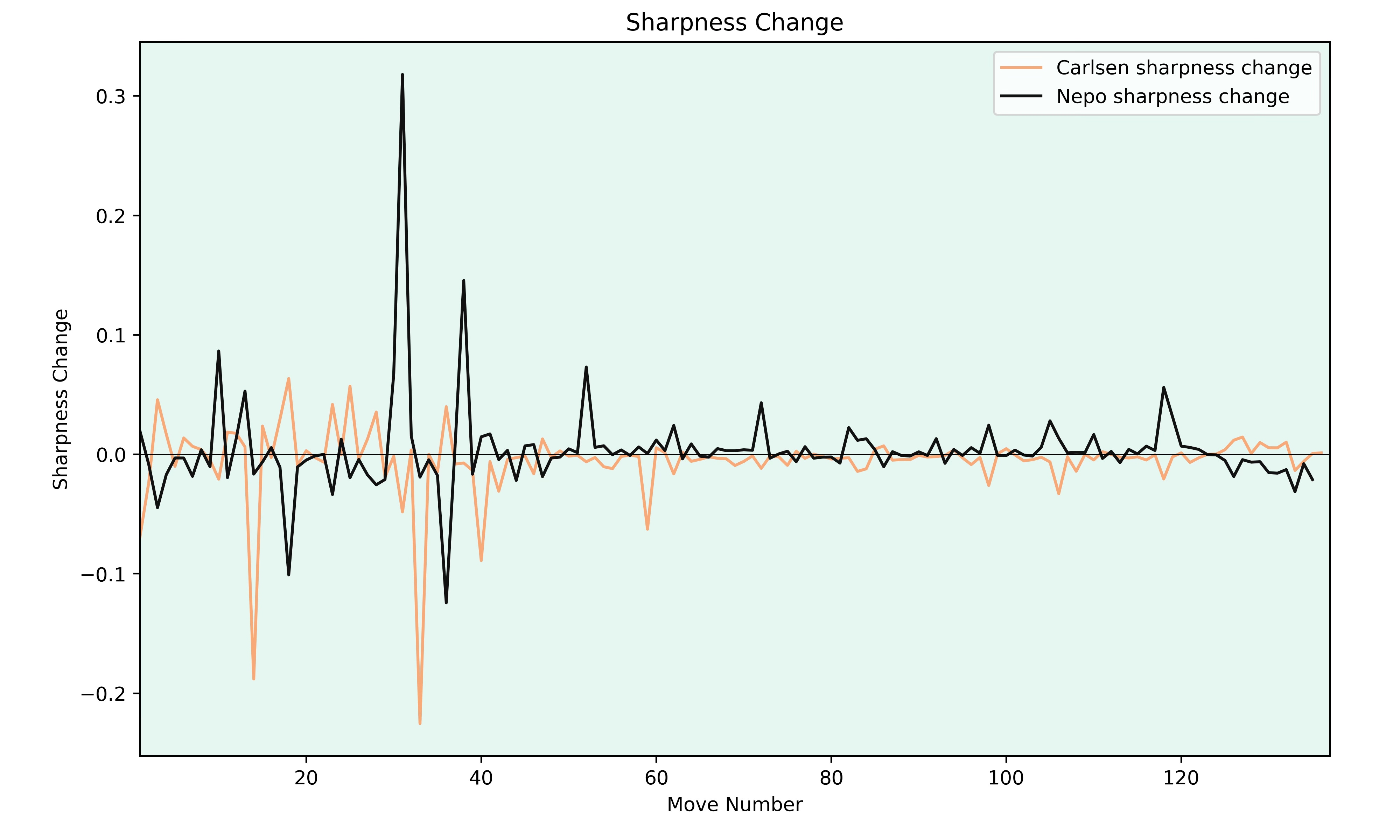
The sharpness graph for the Carlsen-Nepo game doesn't show too many big jumps. There is much volatility around move 30, but this is connected with the mistakes both players made there (see the WDL graph). Once the game settled down afterwards, there weren’t many opportunities to increase the sharpness.
Piece Activity
Another important factor in a game can be the activity of the pieces. To calculate the piece activity, I added up the number of moves the pieces for each side have. I gave bonuses if the piece could move to squares in the opponent's half or squares around the opponent's king. Plotting the piece activity after each move lead to the following graph.
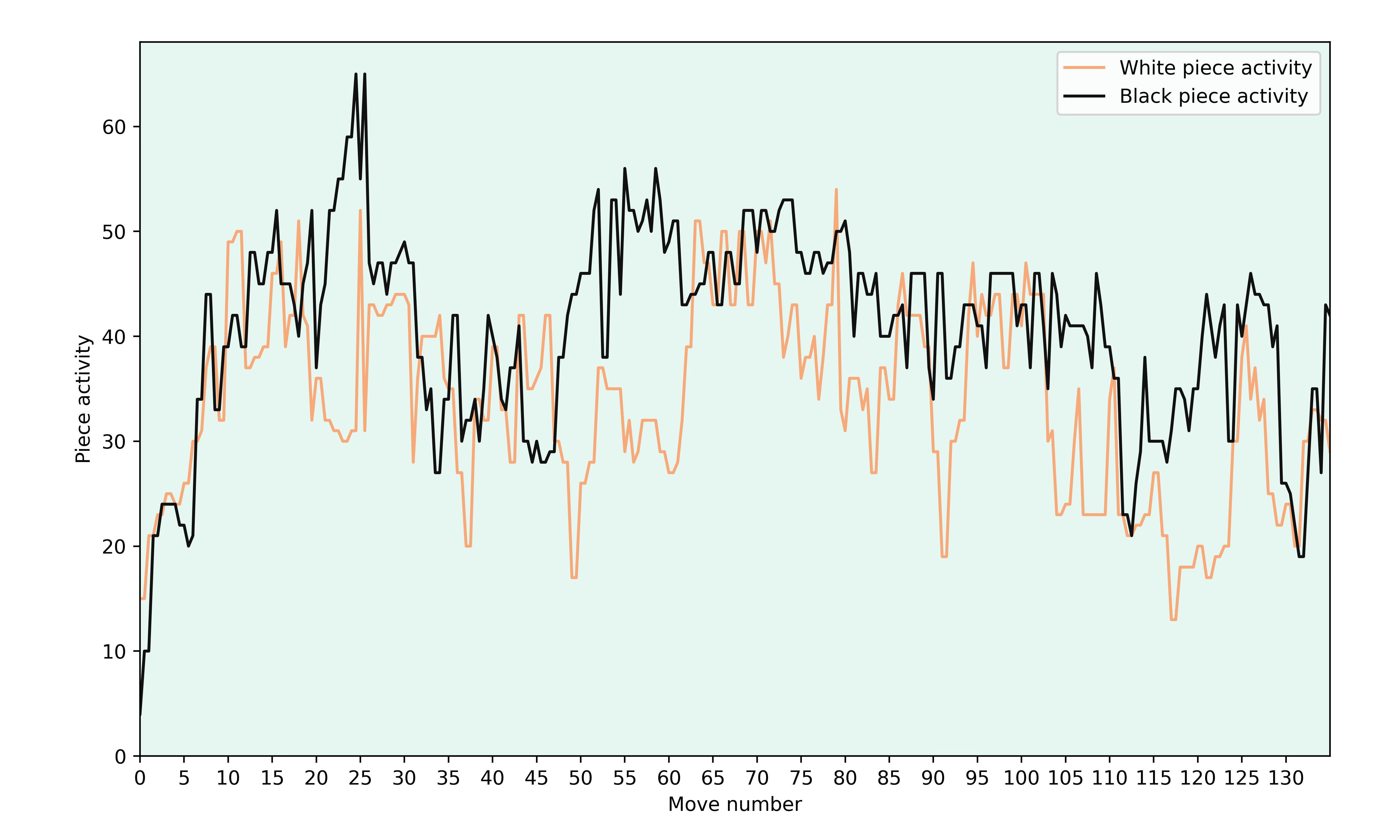
For the first 20 moves, there is no big difference between the piece activity of both sides. Then Black had much more active pieces for moves 20 to 30 and it levelled out again. After move 45 Nepo’s piece activity was again higher (the material imbalance might be a reason for this) even though Carlsen was the one playing for the win.
Piece Heatmaps
Finally, I thought that it might be interesting to look at heatmaps of the pieces.
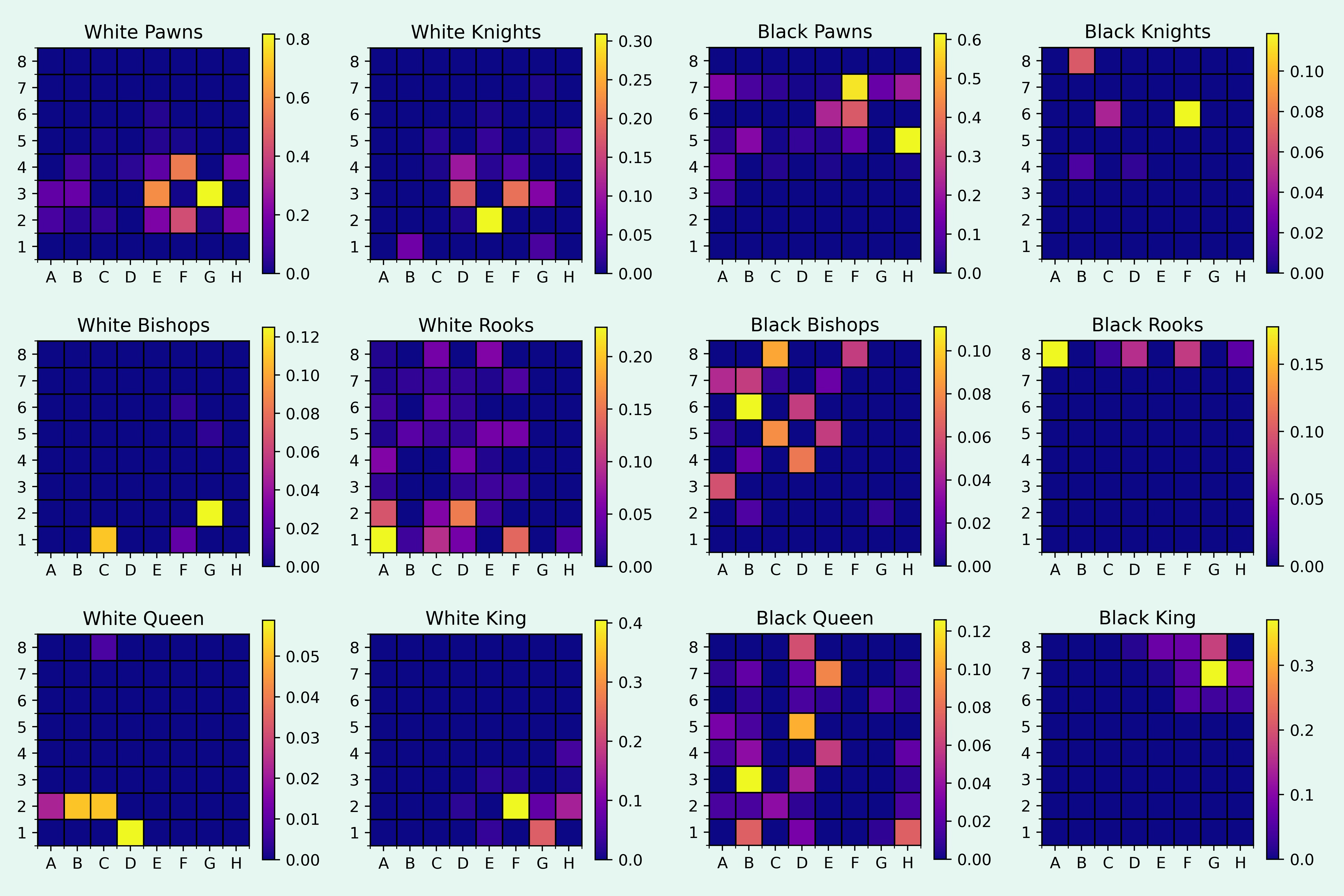
I think that the heatmaps are mostly fun to look at, but one thing that stands out is that the white rooks and the black queen moved around a lot.
What do you think?
I want to do more posts about games and tournaments in the future, especially during the world championship match. So I'm very interested to hear what you think about the various graphs I've shown.
If you have any additional suggestions for graphs and stats, let me know!
In general I say the more metrics the better. I did not see the boards, here, (I could go look, but I am going to talk generally). But it was nice that there was not domination early that got compounded at least not of the direct immediate measures (some of which derived from many games behind the sources tools in some of the function graphs). I still have a problem with heatmaps because they are not about the interactions networks of the pieces, and more about their location stability or not. Well, it is something to know for sure what things were more transient in location than others for sure. I can't vote on any. I think it is more interesting to look at all of them in parallel. Perhaps some superimposition visualization (nothing in mind, just was curious at some point to align more than one function in one figure. Although the persistant abscissa scale of the move number allowed some visual memory above and below to work well.
My point about heatmap (which is about each movable actors localisation dynamic density through whole game, if i got it right), lacking the interaction aspect, is possibly related to the follow reaction i had reading this:
"After move 45 Nepo’s piece activity was again higher (the material imbalance might be a reason for this) even though Carlsen was the one playing for the win."
As the game progressed, one can think of a gaz of 32 points that gets loose at time=0, and while the players may have plans, it is clear that the maximal crampiness will have to lose its minimal energy or maximal order or lack of mingling "information" (not talking about move sequence surprise or information here, but the board location 32 point set). In that sense, it might be that activity with the pressure bias metric being on the other territory and the king safety donut or zone (or where it might have more probabllities of going, one could talk about leading the ulitmate target at slow chess turn by turn time), might lose its total imbalance on the player to player axis (sorry but I am prudent with the word imbalance, so talking weird than might be needed, i also do not know the most usual word for that dimension which is an elephant in the discourse, not horizontal not exactly vertical but yes related, but not just of the plan dimensions). lots of ramblinjg....
So my point is that activity on the empty board, even if piecewise weighted, might be more of an early or middle game dpeth thing, as some point you might want metric of inter-mingling as it might refine notion of "space" under control. depending on the position nature.. long range highways, versus many pawn obstacles. Or bring in your not exactly turn by turn path likelyness (my word) single piece paths (not heatmap, or do they help with that). you could then modulate the 16x16 acitivity vector by the now more informed 64 small square desirablilty "density".. Sorry i come from continuous time and mostly continuous space dynamical system modelling. but that should not stop me making some sense in this discrete space and distrete time problem. I hope I do make some sense. enough to suggest the reader (and author) own better thinking about this.
Interesting concepts, love the data viz, as always!